AI in Ecommerce: 10 Ways to Save Time and Boost Efficiency
October 7, 2026
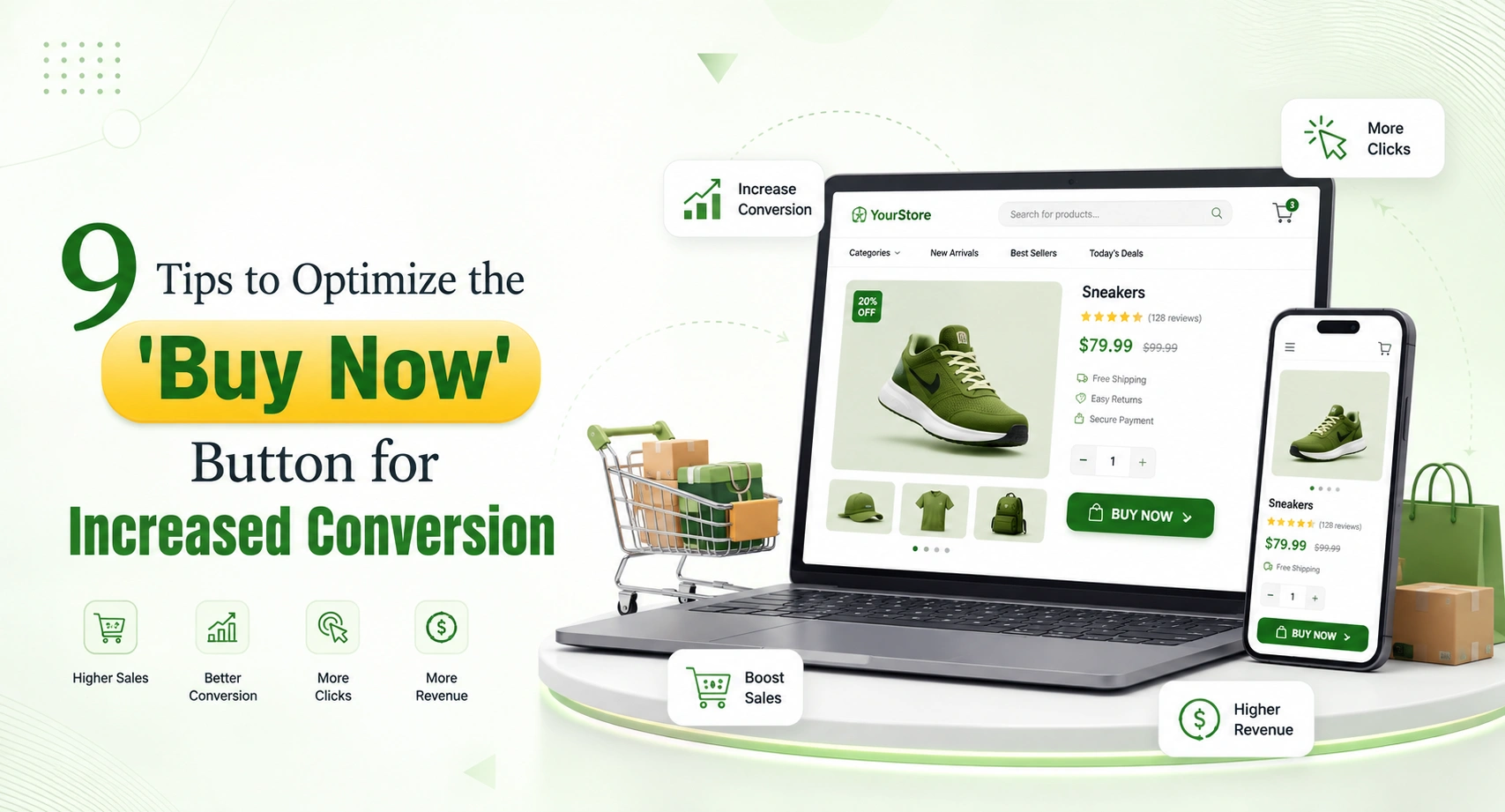
The Buy Now button may seem like a small detail on an online store, but it serves an essential purpose in helping people go from considering to buying a product. A person can spend some time comparing products, checking reviews, and looking at prices, but the deciding factor in the buying process is what happens when they actually want to make a purchase.
The Buy Now button may be just a part of the web design. Its position on the page, wording, visibility, and the context it is presented in matter a lot. It’s critical for any online business using e-commerce solutions in India to make their online shopping experience easier and faster to navigate. We offer various tips you can use to improve your Buy Now button.
1. It is important to position the call to action at places where customers make the buying decision
The most common practice is to include your main call to action buttons on the page close to the following relevant content:
If the product page is long, you might want to consider adding the call to action at various parts of the page instead of forcing shoppers to scroll back to the top.
The important idea is to make sure that customers can follow the next steps whenever they decide to make a purchase.
2. Design for Visibility Without Introducing Visual Clutter
A Buy Now button needs to be distinct from other elements around it but this does not mean it has to be huge or bold. A good design should establish the following hierarchy:
Product info → Buying decision → Main CTA
Relevant spacing, easily readable fonts, and a button form that contrasts with other elements of your website’s design will be essential for achieving this goal.
Ultimately, a good ecommerce site builder should give a business enough creative freedom to establish this ordering without having to write code.
3. Use Action-Oriented CTA Copy
“Buy Now” is familiar, but it is not always the only option.Depending on your business model, alternatives could include:
The right wording depends on what happens after the click. For example, if the customer immediately enters checkout, “Buy Now” can communicate that direct journey clearly. If the customer continues shopping, “Add to Cart” may better describe the action.
CTA copy should set an accurate expectation—not simply try to create urgency.
4. Eliminate Ambiguity Before Prompting for Action
On occasion, the issue does not solely lie with the button but rather in everything that surrounds it and isn’t there.Prior to prompting customers to buy, clarify the inquiries that could keep customers from making the purchase:
Is the item in stock?
When will it be delivered?
How can I make the payment?
Am I able to return the item?
What is the shipping fee?
Is the item fitting for my requirements?
This is crucial for an ecommerce service aimed towards Indian businesses owing to how broad the differences in delivery, COD, shipping duration, and payment systems apparently are.
5. Simplifying Mobile Purchases
Having stunning and eye-catching desktop website does not means that mobile buying experience will be
great as well.The ‘Buy Now’ button must be:
– proper size so that the user can tap on it with ease
– visible for smaller screens
– correctly positioned so as not to obscure other important pieces of information
– good across screen sizes
– linked to mobile checkout
Mobile optimization means not only looking at the button itself but also watching other aspects like product images, different product types, forms, payment options etc.
6.Trust Elements Must Be Placed Close to Moments Of Purchase
At times, the customer may get unsure right at the moment of purchase.Properly located trust elements can help calm apprehension without cluttering the page. You may want to include:
Secured payment | Easy return | Delivery info | Customer ratings
Properly placed trustworthy reviews, transparent refund policy, and well-known methods of payment might ease the worry of customers. The essential rule is transparency. Trust signals must reflect real policies and capabilities and avoid the creation of false reassurance.
7. Assess the Overall Purchase Path
Button color adjustment represents only one of several possible trials.More effective conversion optimization involves looking at the full process of:
Product page → CTA → Cart/Checkout → Payment → Order confirmation
Different factors can be tested:
CTA text
Position of the button
Format of the product page
Communication of delivery options
Placement of reviews
Length of the checkout form
Possibility of guest checkout
A/B testing will allow to find out if a change has really positively impacted customer behavior instead of basing decisions on assumptions. For companies that collaborate with ecommerce agencies, these experiments may be included into their conversion optimization strategy.
8. Do Not Create Pressure While Making Urgency
Time limits, product availability, and time to promote products may affect purchases only if they are real. For instance:
“Only 4 left in stock” must be real stock levels.
The same goes for the suggestion to buy products before expiration of offers or closing of sales. An ecommerce growth platform that serves its purpose properly will help with combining promotions, product details, inventory visibility, and customer experience so that clients do not feel that the company is trying to manipulate them.
9. Do Not Allow the Click to Be the End of Your Optimization
It is important not only that your customer clicks on Buy Now.Further actions are equally important too. For effective checkout process, you need to provide your user with:
Easy navigation
Clear prices
Shipping fees
Various ways to pay
Form fields that are not superfluous
Mobile optimization of forms
Order confirmation
If people click on the Buy Now button but leave the checkout process, then the CTA is doing its job, but the issue is just shifted further down the funnel. This is why the modern ecommerce solutions in India should be regarded as full-fledged commerce systems, not just as web design platforms.

It will be easier to optimize a Buy Now button if the technology behind it is designed to cater to the complete process. While selecting an ecommerce technology company or an ecommerce platform, you should consider features like:
Responsive storefront design
Product and inventory management
Theme customization
Mobile optimized checkout process
Integration with payment gateways
Order management
Marketing tools
Analytics
SEO optimization
Product and customer data management
These features might become even more critical for an ecommerce platform for D2C brands as the product catalogs, traffic, and orders increase.Businesses can also consider working with an ecommerce agency India in case of specialized requirements.
Idiocom describes itself as a growth platform for e-commerce as compared to just being a website builder. The company’s ecosystem consists of the development of storefront, products, inventory, orders, marketing, analytics, and catalog capabilities with the help of AI.
This is relevant as conversion is not about pressing one button. Good customer experience in terms of purchasing requires the collaboration between the storefront, products, inventory, checkout, marketing, and operations. If you need advice, you can get professional advice from the e-commerce experts of India to see at what points customers fail the buying process and what needs to be improved first.
The effectiveness of the Buy Now button cannot be achieved through the selection of a more attractive colour or through making the button larger. Rather, it is achieved through the design of an efficient customer journey. Make the CTA visible, make the next action clear, eliminate purchase doubts, optimize for mobile, offer real trust signals, and constantly test the CTA. But above all, make sure that the post-click customer journey is as efficient as the pre-click one.
When looking for an ecommerce platform India, it is not enough for the platform to have an option for a Buy Now button. The real issue is whether the technology will allow you to develop and optimize your entire ecommerce journey around it.
Does the Buy Now button increase ecommerce conversion rates?
It doesn’t necessarily have an effect in itself but is contingent on elements like the value of the product, design of the page, trust level of the customer, price, availability, checkout experience, and total user experience.
Should I use “Buy Now” or “Add to Cart”?
The choice is dependent on the customer’s path of purchase; “Buy Now” implies that you want the customer to complete their purchase, whereas “Add to Cart” allows them to shop further before completing the process.
Where should the Buy Now button be located?
It should be placed near key purchasing information such as price, choices, availability, and shipping information. In case of longer pages, strategically placed calls-to-action can help with purchasing.
How do I optimize the Buy Now button for mobile?
Make sure it is large enough to tap, keep proper spacing, and ensure that it is easily locatable and linked to the checkout experience for mobile users.